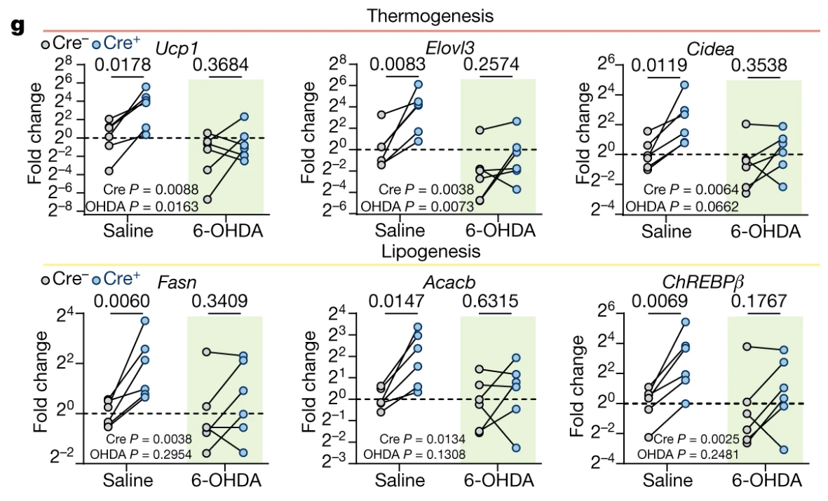
Fig 3g – The role of somatosensory innervation of adipose tissues
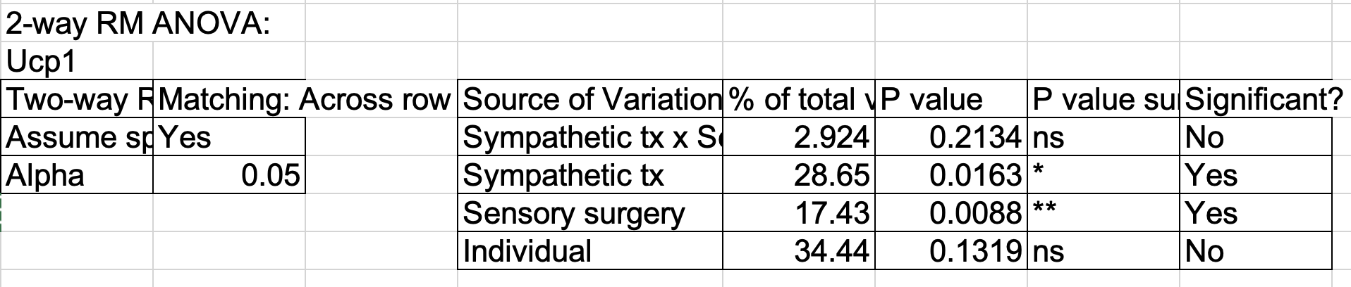
Fig 3g is a split-plot design. I often see researchers analyze these using separate paired t-tests. This isn’t so bad, but is limiting, and a better alternative is a linear mixed model. But does this replicate the Repeated Measures ANOVA in GraphPad used by the researchers? It does! Yaaay!
Saline (control). In the Excel file, this is labeled “SAL”. This should result in intact sympathetic activity.
6-OHDA (treatment). In the Excel file, this is labeled “OHDA”. This is 6-hydroxydopamine, a sympathetic neurotoxin that inhibits sympathatic activity.
Factor 2: surgery
Cre- (control). In the Excel file, this is labeled “YFP”. This is a control for the Cre injection. This should result in an intact sensory system of fat.
Cre+ (treatment). In the Excel file, this is labeled “Cre”. This should result in an ablated sensory system of fat.
Blocking or whole plot factor: ear_tag. This is the mouse ID.
For the tx treatment, either saline or 6-OHDA was delivered to both sides of a mouse. For the surgery treatment, one side was injected with Cre- and one with Cre+.
There are six response variables, each a log2 fold-change for the thermogenic and lipogenic genes:
Ucp1
Elovl3
Cidea
Fasn
Acacb
ChREBPβ
comments:
Split plot design. Cre ablation of one limb under two different conditions. Each condition is a different mouse. Researchers used RMANOVA.
use base 2 for fold change! Yaaaay!
All statistical results in Excel file! Yaaaay! This should be mandatory.
What is a randomized split plot design (RSPD)?
This is a randomized split plot design. tx (Sal or OHDA) is randomly assigned to Mouse - a mouse is the “plot”. Within a mouse, surgery (YFP or Cre) is assigned to side – this is the “subplot”. Mouse acts like a blocking factor for surgery but a completely randomized factor for tx. There is no subplot replication within a plot (mouse) so the linear mixed model (using R formula notation) is
fc ~ tx * surgery + (1 | ear_tag)
The factor ear_tag is a random intercept.
A question I had with this is, can I replicate the researcher’s results, as they used “Repeated Measures ANOVA” in GraphPad Prism. In general, I can replicate GraphPad results with a blocked design but I haven’t tried a split plot design (generally because I don’t think that I’ve found a paper with a split plot design that was analyzed in GraphPad using RM ANOVA)
Advantages of the linear mixed model
it can handle missing data – ANOVA throws out data points if there is any value missing value within the Plot variable (here, this is mouse ear_tag)
it is easy to handle non-normal data using generalized linear mixed models – ANOVA is for linear models only, although one can transform the response.
it is flexible, for example it is easy to add covariates. This isn’t so important for the bench biology data that I mostly see, although it is useful for example if a response was dependent on mouse weight and we wanted to adjust for weight without using a ratio.
Advantages of the RM ANOVA model 1. It always works! LMM algorithms can fail, and not infrequently.
Setup
Import and Wrangle
Note: there are two sets of Fig 3g data. The bottom set looks like it is the top set recentered so that the mean of the SAL-YFP treatment has is mean zero. Since the data in the figure looked centered this way, I’ll import the bottom set.
Code
data_from <-"The role of somatosensory innervation of adipose tissues"file_name <-"41586_2022_5137_MOESM7_ESM.xlsx"file_path <-here(data_folder, data_from, file_name)fig3g <-read_excel(file_path,sheet ="3g",range ="B34:K58",col_names =TRUE) |>data.table() |>clean_names()fig3g[, surgery :=factor(surgery, levels =c("YFP", "Cre"))]fig3g[, tx :=factor(tx, levels =c("SAL", "OHDA"))]# output as clean excel filefileout_name <-"fig3g-SPD-The role of somatosensory innervation of adipose tissues.xlsx"fileout_path <-here(data_folder, data_from, fileout_name)write_xlsx(fig3g, fileout_path)
Fit the models
Create a function to fit the same models to each of the six responses. This is better practice than cut and paste because its less like to leave bugs if edits are made to code. Two models are fit: lmm1 – a linear mixed model with a random intercept, aov1 – a repeated measures ANOVA model
Code
lmm1_fit <-function(y_label){# y_label is the column name of the response variable r_formula <-paste(y_label, "~ tx * surgery + (1 | ear_tag)") |>formula() lmm1 <-lmer(r_formula, data = fig3g)return(lmm1)}aov1_fit <-function(y_label){# y_label is the column name of the response variable r_formula <-paste(y_label, "~ tx * surgery + (surgery | ear_tag)") |>formula() aov1 <-aov_4(r_formula, data = fig3g)return(aov1)}fig3g_lmm1 <-list()fig3g_aov1 <-list()y_list <-c("ucp1", "elovl3", "cidea", "fasn", "acacb", "ch_reb_pb")for(i in1:length(y_list)){ y_label <- y_list[i] fig3g_lmm1[[y_label]] <-lmm1_fit(y_label) fig3g_aov1[[y_label]] <-aov1_fit(y_label)}# get emmeans using functionemmeans_out <-function(m1){# m1 is the fit model m1_emm <-emmeans(m1,specs =c("tx", "surgery"))return(m1_emm)}fig3g_lmm1_emm <-list()fig3g_aov1_emm <-list()for(i in1:length(y_list)){ y_label <- y_list[i] fig3g_lmm1_emm[[y_label]] <-emmeans_out(fig3g_lmm1[[y_label]]) fig3g_aov1_emm[[y_label]] <-emmeans_out(fig3g_aov1[[y_label]])}pairs_out <-function(m1_emm){# m1 is the fit model m1_pairs <-contrast(m1_emm,method ="revpairwise",simple ="each",combine =TRUE,adjust ="none") |>summary(infer =TRUE) |>data.table()return(m1_pairs)}fig3g_lmm1_pairs <-list()fig3g_aov1_pairs <-list()for(i in1:length(y_list)){ y_label <- y_list[i] fig3g_lmm1_pairs[[y_label]] <-pairs_out(fig3g_lmm1_emm[[y_label]]) fig3g_aov1_pairs[[y_label]] <-pairs_out(fig3g_aov1_emm[[y_label]])}
lmm1 and aov1 give the same results here because there is no missing data, which the lmm is better at handling. Both replicate the GraphPad Prism results.
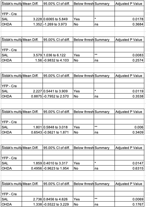
Contrasts replicate!
Code
# create a column of sidak adjusted p-values in the contrast tablesfor(i in1:length(y_list)){ # over the 6 responses m1_pairs <- fig3g_lmm1_pairs[[y_list[i]]] m1_pairs[3:4, p_sidak :=Sidak.p.adjust(p.value)] fig3g_lmm1_pairs[[y_list[i]]] <- m1_pairs}# make a pretty output tablecontrast_table <-data.table(NULL)keep_cols <-c("tx", "contrast", "estimate", "p_sidak")for(i in1:length(y_list)){ # over the 6 responses m1_pairs <- fig3g_lmm1_pairs[[y_list[i]]] contrast_table <-rbind(contrast_table, m1_pairs[3:4, .SD, .SDcols = keep_cols])}contrast_table |>kable(digits =4) |>kable_styling() |>pack_rows(y_list[1], 1, 2) |>pack_rows(y_list[2], 3, 4) |>pack_rows(y_list[3], 5, 6) |>pack_rows(y_list[4], 7, 8) |>pack_rows(y_list[5], 9, 10) |>pack_rows(y_list[6], 11, 12)
tx
contrast
estimate
p_sidak
ucp1
SAL
Cre - YFP
-3.2278
0.0178
OHDA
Cre - YFP
-1.3522
0.3684
elovl3
SAL
Cre - YFP
-3.5792
0.0083
OHDA
Cre - YFP
-1.5600
0.2574
cidea
SAL
Cre - YFP
-2.2268
0.0119
OHDA
Cre - YFP
-0.8875
0.3538
fasn
SAL
Cre - YFP
-1.8012
0.0060
OHDA
Cre - YFP
-0.6543
0.3409
acacb
SAL
Cre - YFP
-1.8589
0.0147
OHDA
Cre - YFP
-0.4956
0.6315
ch_reb_pb
SAL
Cre - YFP
-2.7360
0.0069
OHDA
Cre - YFP
-1.3383
0.1767
Fig 3g contrasts from the Excel file
Notes
the direction of my contrast is Cre+ - Cre- (or, using the Excel file labels, this is Cre - YFP), since I like the direction to be what happens when you add the treatment, relative to a control.
The authors used a Sidak adjustment on the two simple Cre- - Cre+ contrasts only.
The contrasts replicate (other than the sign, but that is because I chose the opposite direction of the contrast)!
I do have thoughts on the correction:
The researchers do not state why the set of adjusted p-values is 2 (the two simple effects of surgery) and not 4 (the additional two simple effects tx).
The holm method of adjustment is more powerful than Sidak.
I would not adjust if I were only investigating ucp1 as the response. Each of these is a test of its own question with different expectations given working knowledge. See xxx.
That said, there are 6 response variables from the experiment and if our hypothesis is something like “is there some difference in gene expression given this set of genes?” then I would adjust using the FDR, as this is a question applied to the whole gene set. This is exactly the norm in gene expression studies with thousands of genes. I never see researchers adjust for multiple responses except in these large large gene expression studies (or similar). So there is inconsistency in the logic applied to the statistical analysis not just within a field but within a single paper.
How I would adjust: adjusting all 6 responses using FDR
Code
# this seems ultra klunky but it worksp <-numeric(length(y_list))for(j in1:4){ # do this for each simple effect in the contrast tablefor(i in1:length(y_list)){ # over the 6 responses m1_pairs <- fig3g_lmm1_pairs[[y_list[i]]] p[i] <- m1_pairs[j, p.value] } p_adj <-p.adjust(p, "fdr")for(i in1:length(y_list)){ # over the 6 responses m1_pairs <- fig3g_lmm1_pairs[[y_list[i]]] m1_pairs[j, p_fdr := p_adj[i]] fig3g_lmm1_pairs[[y_list[i]]] <- m1_pairs }}# create a table of p-values for cre contrasts onlyout_table <-data.table(response = y_list,Sal_p =numeric(length(y_list)),OHDA_p =numeric(length(y_list)),Sal_fdr =numeric(length(y_list)),OHDA_fdr =numeric(length(y_list)))for(i in1:length(y_list)){ # over the 6 responses m1_pairs <- fig3g_lmm1_pairs[[y_list[i]]] out_table[response == y_list[[i]], Sal_p := m1_pairs[3, p.value]] out_table[response == y_list[[i]], OHDA_p:= m1_pairs[4, p.value]] out_table[response == y_list[[i]], Sal_fdr := m1_pairs[3, p_fdr]] out_table[response == y_list[[i]], OHDA_fdr := m1_pairs[4, p_fdr]] }out_table |>kable(caption ="unadjusted and FDR adjust p-values for Cre+ - Cre- contrasts within Saline and 6-OHDA treatments") |>kable_styling()
unadjusted and FDR adjust p-values for Cre+ - Cre- contrasts within Saline and 6-OHDA treatments
What’s going on with the direction of the effect in Fig 3g? Compare my figure with the published figure.
Fig 3g
Compared to my figure built from the archived data, the data in Fig3g is reflected about the horizontal axis at y = 0, that is, the data are upside down, so the apparent direction of the differences is exactly opposite that of the archived data in the Excel file. The GraphPad prism contrasts tables in the Excel file match the archived data in the Excel file and not the plotted data. This doesn’t matter for the p-values but since directions of the differences are exactly opposite, the interpretation of the results is exactly opposite.
So, what’s up with the reflected (upside down) data? The matrices of archived values are \(\Delta C_q\) and centered (\(\Delta\Delta C_q\)) values, which decrease as expression levels increase. We want an increase in expression to look like an increase in the y-value. So to get the effects in this meaningful direction, we can multiply the \(\Delta C_q\) values by -1.
Let’s reflect the \(\Delta\Delta C_q\) values by multiplying them by -1 and replot:
Code
# reflect the values in the response variablesfig3g[, ucp1_ref :=-ucp1]fig3g[, elovl3_ref :=-elovl3]fig3g[, cidea_ref :=-cidea]fig3g[, fasn_ref :=-fasn]fig3g[, acacb_ref :=-acacb]fig3g[, ch_reb_pb_ref :=-ch_reb_pb]y_list_ref <-paste0(y_list, "_ref")gg_list <-list()for(i in1:length(y_list)){ m1_pairs <- fig3g_lmm1_pairs[[y_list[i]]]# use the sidak p-values m1_pairs[, p.value := p_sidak] gg <-plot_it(y_col = y_list_ref[i], m1_pairs) gg_list[[y_list[i]]] <- gg}plot_grid(plotlist = gg_list, nrow =2)
Published methods, cut and pasted from the article
A combination of axonal target injection of retrograde Cre and somatic expression of a Cre-dependent payload has been widely used to manipulate projection-specific circuits in the brain. However, legacy peripheral viral tracers such as pseudorabies virus and herpes simplex virus are highly toxic, restricting their use beyond acute anatomical mapping. In search for newer and safer viral vectors suitable for long-term functional manipulations, we found that AAV9 exhibited a high retrograde potential from iWAT to DRGs (Extended Data Fig. 4a). We adopted a published viral engineering pipeline22 to generate randomized mutants of AAV9 (Extended Data Fig. 4b,c). Although our initial intent was to improve retrograde efficiency from fat to DRGs, the evolved new retrograde vector optimized for organ tracing (or ROOT) is more desirable mainly for its significantly reduced off-target expression such as in SChGs, contralateral DRGs and the liver (Fig. 2a,b and Extended Data Fig. 4d–g).
ROOT provides an opportunity to specifically ablate the sensory innervation in fat—we injected Cre-dependent diphtheria toxin subunit A (DTA) construct (mCherry-flex-DTA) into the T13/L1 DRGs bilaterally while injecting Cre- or YFP-expressing ROOT unilaterally in the iWATs (Fig. 2c).
As thermogenic and lipogenesis programs are both downstream of sympathetic signalling24,26,29, we next tested whether the sensory-elicited gene expression changes are dependent on intact sympathetic innervation. We bilaterally injected 6-OHDA—a catecholaminergic toxin for selective sympathetic denervation (Extended Data Fig. 6c,d)—into the iWAT of mice that had previously undergone unilateral sensory ablation (Fig. 3f).